Introduction
Today we’re going to geek out even more than usual. Follow me down memory lane! My first job was to write code that processed data from testing integrated circuits. That was an eternity ago, but what I learned about signal processing turned out to be applicable to pretty much any kind of time series data.
So I thought I should play around with some of the time series data I have stored in Wavefront.
Of course, it deserves to be said that Wavefront can do almost any math natively in its web user interface. So I really had to think hard to come up with something that would give me an excuse to play around with the Wavefront API and some Python code.
Here’s the example I came up with: Find out which objects exhibits the highest degree of periodic self similarity on some metric. For example, tell me which VMs have a CPU utilization that have the strongest tendency to repeat themselves over some period (e.g. daily, hourly, every 23.5 minutes, etc.).
A possible application for this may be around capacity planning. By understanding the which workloads have a tendency to vary strongly and predictably over some period of time, we may be able to place workloads in such a way that their peak demands don’t coincide.
The first few paragraphs of this post should be interesting to anyone wanting to do advanced data processing of Wavefront data using Python. The final paragraphs about the math are mostly me geeking out for the fun of it. It can be safely ignored if it doesn’t interest you.
Problem Statement
The purpose of the tool we’re building in this post is to answer the question: “Which objects have the strongest periodic variation (seasonality) on some metric?”.
For example, which VMs have a CPU load that tends to have a strong periodic variation? And furthermore, what is the period of that variation?
Usage
It should be pointed out that this tool would need some work before it’s useful in production. It is intended as an example of what can be done.
To obtain the code, clone the repository from here or download this single Python file.
To run the code, you have to set the following two environment variables:
- WF_URL – The URL to your Wavefront instance, e.g. https://try.wavefront.com
- WF_TOKEN – Your API token. Refer to the Wavefront documentation for how to obtain it.
python fft.py name.of.metric
You can add the –plot flag at the end of the command to get a visual representation of the top periodic time series.
The output will be a list of object names, period length in minutes and peak value.
Example:

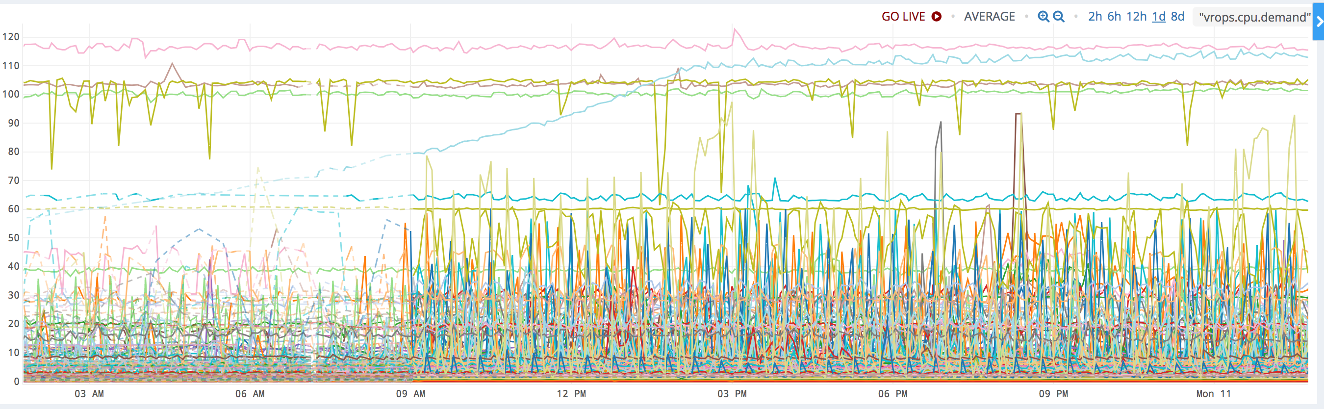
Let’s pick an example and examine it!
nsx-mgr-west,31.45390070921986,0.17699407037085668
The first column is just the name of the object. The next column says that the pattern seems to repeat every 31.5 minutes. The third column is the relative spectral peak energy. The best way of interpreting that is by saying that 18% of the total “energy” of the signal can be attributed component that repeats itself every 31.5 minutes.
Let’s have a look at the original time series in Wavefront and see if we were right!

Yes indeed! It sure looks like this signal is repeating itself about every 30 minutes.
A Note on Accuracy
Why did we get a result of 31.5 minutes? Isn’t it a little strange that we didn’t get an even 30 minutes? Yes it is and there’s a reason for it. The algorithm introduces false accuracy. In our example, we’re processing 5 minute samples, so the resolution will never get better than 5 minutes. Therefore, you should round the results to the nearest 5 minutes.
Data Source
The data for this example comes from one of our demo vRealize Operations instances and was exported to Wavefront using the vRealize Operations Export tool that can be found here.
Design
The design is very simple: We use Python to pull down time series data for some set of objects. Then we’re using the SciPy and NumPy libraries to perform the mathematical analysis.
SciPy
SciPy (which is based on Numpy) is an extensive library for scientific mathematics. It offers a wide range of statistical functions and signal processing tools, making it very useful for advanced processing of time series data.
High Level Summary of the Algorithm
There are many ways of finding self similarity in time series data. The most common ones are probably spectral analysis and autocorrelation. Here is a quick comparison of the two:
- Spectral Analysis: Transform the time series to the Frequency Domain. This rearranges the data into a set of frequencies and amplitudes. By finding the frequency with the highest amplitude, we can determine the most prevailing periodicity in the time series data.
- Autocorrelation: Suppose a time series repeats itself every 1 hour. If you correlate the the time series with a time shifted version of the same series you should get a very good correlation when the time shift is 1 hour in our example. Autocorrelation works by performing correlations with increasing time shifts and picking the time shift the gave the best correlation. That should correspond to the length of the periodicity of the data.
Autocorrelation seems to be the most popular algorithm. However, for very noisy data, it can be hard to find the best correlation among all the noise. In our tests, we found that spectral analysis (or spectral power density analysis, to be exact) gave the best results.
To find the highest peak in the frequency spectrum, we huse the “power spectrum”, which simply means that we square the result of the Fourier transform. This will exaggerate any peaks and makes it easier to find the most prevalent frequencies. It also creates an interesting relationship to the autocorrelation function. If you’re interested, we’ll geek out over that towards the end of this article.
Once we’ve done that for all our objects, we sort them based on the highest peak and print them. To make the scoring fair, we calculate the total “energy” (sum of “power” over time) and divide the peak amplitudes by that. This way, we measure the percentage that a peak contributes to the total “energy” of the signal.
Code Highlights
Pulling the data
Before we do anything, we need to pull the data from Wavefront. We do this using the Wavefront REST API.
query = 'align({0}m, interpolate(ts("{1}")))'.format(granularity, metric)
start = time.time() - 86400 * 5 # Look at 5 days of data
result = requests.get('{0}/api/v2/chart/api?q={1}&s={2}&g=m'.format(base_url, query, start),
                      headers={"Authorization": "Bearer " + api_key, "Accept": "application/json"})
Next, we rearrange the data so that for each object we have just a list of samples that we assume are spaced 5 minutes apart.
candidates = []
data = json.loads(result.content)
for object in data["timeseries"]:
    samples = []
    for point in object["data"]:
        samples.append(point[1])
Normalizing the data
Now we can start doing the math. First we normalize the data to force it to have an average of 0, a maximum of 1 and a minimum of -1. It’s important to do this to remove any and constant bias (sometimes referred to as “DC-component”) from the signal.
top = np.max(samples)
bottom = np.min(samples)
mid = np.average(samples)
normSamples = (samples - mid)
normSamples /= top - bottom
Turn into a power spectrum using the fft function from SciPy
Now that we have the data on a form we like, use a Fast Fourier Transform (FFT) to go from the time domain to the frequency domain. The output of and FFT is a series of complex numbers, so we take the absolute value (magnitude) of them to turn it into a real number. Finally, we square every value. This will exaggerate any frequency spikes and also has a cool relationship to autocorrelation we’ll discuss later.
spectrum = np.abs(fft(normSamples))
spectrum *= spectrum
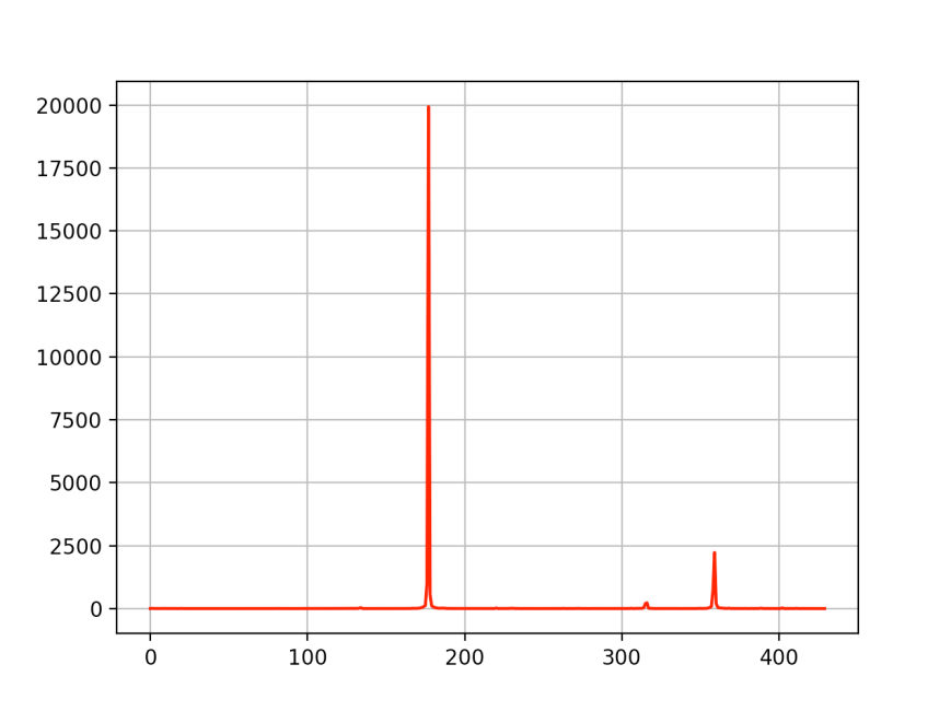
At this point, we should have a spectrum that, for a good match, looks something like this. This corresponds to a signal repeating at a 60 minute interval.
The algorithm we use is has very low accuracy at low frequencies (long cycles), so we dump the firs few samples. It’s important to sample enough of the signal. If we want to detect behaviors the repeat over, say, 24 hours, you should sample at least 5 days of data. This way, we can discard the lowest frequencies and still find what we’re looking for.
offset = 5
spectrum = spectrum[offset:]
Now we can find the peak by simply looking for the highest value in the array. Notice that we’re only looking in the lower half of the array. This is because of a property of the FFT known as “aliasing”. The latter n/2 samples will just be mirror image of the first n/2 ones.
Finding the peak and normalizing
maxInd = np.argmax(spectrum[:int(n/2)+1])
Next we scale the peak we found. In order to compare this peak with peaks we found from other objects, we need to somehow normalize it. A straightforward way of doing this is to estimate how much of the total energy this peak contributed with. Energy is the integral over power, but since we’re operating in a discrete time world, we can calculate it as a simple sum over the spectrum. The result will be the relative contribution this frequency has to the total energy.
energy = np.sum(spectrum)
top = spectrum[maxInd] / energy
The final step of the math is to convert the raw frequency (as expressed by an index in the spectrum array) to a period length.
lag = 5 * n / (maxInd + offset)
Filtering the best matches
We consider a “good” match a peak where the local spectral energy is at least 10% of the total energy. This is an arbitrary value, but it seems to work quite well.
if top > 0.1:
    entry = [ top, lag, object["host"] ]
    candidates.append(entry)
Sorting and outputting
Finally, once we’ve gone through every object, we sort the list based on relative peak strength and output as CSV.
best_matches = sorted(candidates, key=lambda match: match[0], reverse=True)
for m in best_matches:
   print("{0},{1},{2}".format(m[2], m[1], m[0]))
Extra Geek Credits: Autocorrelation vs. Power Spectrum
If you’ve made it here, I applaud you. You should have a pretty good understanding of the code by now. It’s about to get a lot geekier…
Autocorrelation
Mathematically, autocorrelation is a very simple operation. For a real-valued signal, you simply sum up every sample of the signal multiplied by a sample from the same signal, but with a time shift. It can be written like this:
a(τ)=Σx(t)x(t+τ)
Let’s say a signal is repeating itself every 60 minutes. If we set the lag, τ, to 60 minutes, we should get a better correlation than for any other value of τ, since the signal should be very similar between now and 60 minute ago.
So one way to find periodic behavior is to repeatedly calculate the autocorrelation and sweep the value of τ from the shortest to the longest period you’re interested in. When you find the highest value of your autocorrelation, you have also found the period of the signal.
Well, at least in theory.
What ends up happening is that a lot of times, it isn’t obvious where the highest peak is and it could be affected by noise, causing a lot of random errors. Consider this autocorrelation plot, for example.

One thing we notice, though, is that autocorrelations of signals that have meaningful periodic behaviors are themselves periodic. Here’s a good example:

So maybe looking for the period of the autocorrelation would be more fruitful than hunting for a peak? And finding the period implies finding a frequency, which sounds almost like a Fourier Transform would come in handy, right? Yes it does. And there’s a beautiful relationship between the autocorrelation and the Fourier Transform that will take us there.
The final piece of the puzzle
If you’ve read this far, I’m really impressed. But here’s the big reveal:
It can be proven that autocorrelation and FFT are related as follows:
![{\displaystyle {\begin{aligned}F_{R}(f)&=\operatorname {FFT} [X(t)]\\S(f)&=F_{R}(f)F_{R}^{*}(f)\\R(\tau )&=\operatorname {IFFT} [S(f)]\end{aligned}}}](https://wikimedia.org/api/rest_v1/media/math/render/svg/41ba8c3c366062d1c22b4ad97968f52961a40e82)
Where R(τ) is the autocorrelation function.
In other words: The autocorrelation is the Inverse FFT of the FFT of the signal, multiplied by the complex conjugate of the FFT of the signal.
But an complex number multiplied by its own conjugate is equal to the square of the absolute value. So S(f) is really the same as |FFT[X(t)]|2. And since S(f) is the step right before the final Inverse FFT, we can conclude that it must be the FFT of the autocorrelation. So we can comfortably state:
The power spectrum of a signal is the exact same thing as the FFT of its autocorrelation!
Why it’s cool
Not only is the power spectrum a nice way of exaggerating peaks to make them easier to find. The peak of the power spectrum can also be interpreted as a measure of the prevailing period of the autocorrelation function, which, in turn, gives a good indication of the prevailing period of the data we’re analyzing.
Caveats
As I said in the beginning of this post, this code isn’t production quality. There are a few things that should be addressed before it’s useful to a larger audience.
- All data is loaded into memory. That obviously won’t scale. Instead, we should used a streaming JSon parser and maybe split the query up into smaller shunks.
- The calculation of the local spectral energy is very naive. It’s assuming that all the energy is concentrated in a single spike of unity length. It should be adjusted to account for spikes that are spread out across the spectrum.
- The accuracy, especially at low frequencies, is rather poor. One possible improvement would be to use FFT to find the candidates and autocorrelation to fine tune the result.
Conclusion
The idea behind this post was to discuss how Python and a math library like SciPy can be used to analyze Wavefront data. Feel free to comment and to fork the code and make improvements!