
Background
Although vRealize Operations has a really solid report generator built in, I often get the question how to hook up an external report generator to vRealize Operations. Sometimes users need some piece of functionality not found in the standard report generator and other times they want to bring data from vRealize Operations into an existing corporate reporting framework.
This led me to spend some time experimenting with Pentaho Report Designer and Pentaho Data Integration (also known as Kettle).
This discussion is going to get pretty technical. But don’t worry if you can’t follow along with every step! The transformation and report are available for download at the end of the article!
What is Pentaho and why do I use it?
Pentaho is an analytics and business intelligence suite made up of several products. It was acquired by Hitachi who sells a commercial version of it but also maintains free community version. In this post, we’re using the community version. Although I haven’t tested it with the commercial version, I’m assuming it would work about the same.
For this project, we’re using two components from Pentaho: Kettle (or data integrations) and Pentaho Reports. Kettle is an ETL tool that lets us take data from an arbitrary source and normalize it so it can be consumed by Pentaho Reports.
Getting the data
Typically, report generators are used with data from a SQL database, but since metrics in vRealize Operations reside in a distributed proprietary datastore, this is not a feasible solution. Also, database-oriented solutions are always very sensitive to changes between versions of the database schema and are therefore typically discouraged.
Instead, we are going to use the vRealize Operations REST API to gain access to the data. Unfortunately, Pentaho Reports doesn’t have an native REST client and there’s where Kettle comes in. As you will see, the report works by using a Kettle transformation as a data source.
Goals for this project
The goal for this project is very simple. We are just going to create a report that shows our VMs and a graph of the CPU utilization for each one of them. In subsequent posts, we are going to explore some more complex reports, but for now, let’s keep it simple. The report is going to look something like this:

Solution overview
DISCLAIMER: I am not a Pentaho expert by any means. In fact, I’ve been learning as I’ve been working on this project. If you know of a better way of doing something, please drop me a note in the comments!
This overview is intended to explain the overall design of the solution and doesn’t go into detail on how to install and run it. See the section “Installing and running” below for a discussion on how to actually make it work.
Kettle Transformation
To produce the data for the report shown above, we need to perform to major tasks: We need to ask vRealize Operation for a list of all eligible VMs and we need to ask it for the CPU demand metric for each one of them.
Kettle principles
Before we get into the design, it’s necessary to understand how Kettle operates. The main unit of work for Kettle is a rowset. This is essentially a grid-like data structure resembling a table in a SQL database. As the rowset travels through a transformation pipeline, we can add and remove columns and rows using various transformation steps.
Our Kettle Transformation
Transformations in Kettle are built using a graphical tool called “spoon” (yes, there’s a kitchen utensil theme going on here). Transformations are depicted as pipelines with each step performing some kind of operation on the rowset. This is what our transformation pipeline looks like. Let’s break it down step by step!
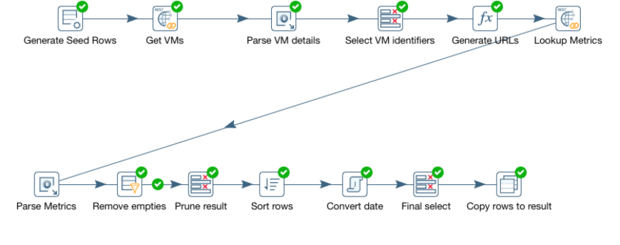
- Generate seed rows. Kettle needs a rowset to be able to perform any work, so to get the process started, we generate a “seed” rowset. In this case, we simply generate a single row containing the REST URL we need to hit to get a list of virtual machines.
- Get VMs. This step carries out the actual REST call to vRealize Operations and returns a single string containing the JSon payload returned from the rest call.
- Parse VM details. Here we parse the JSon and pull out information such as name and ID of the VM.s
- Select VM identifiers. This is just a pruning step. Instead of keeping the JSon payload and all the surrounding data around, we select only the name and the ID of each VM.
- Generate URLs. Now we generate a list of REST URLs we need to hit to get the metrics.
- Lookup Metrics. This is the second REST call to vRealize Operations. This is executed for each VM identified and will look up the last 24 hours of CPU demand metrics and return it as a JSon string.
- Parse Metrics. Again, we need to parse the JSon and pull out the actual metric values and their timestamps. This is actually akin to a cartesian product join in a database. The rowset is extended by adding one row per VM and metric sample. Thus, the number of rows is greatly increased in this step.
- Remove empties. Some VMs may not have any valid metrics for the last 24 hours. This step removes all rows without valid metrics.
- Sort rows. Sorts the rows based on VM name and timestamp for the metric.
- Convert date. Dates are returned from vRealize Operations as milliseconds since 01/01/1970. This step converts them to Date objects.
- Final select. Final pruning of the dataset, removing the raw timestamp and some other fields that are not needed by the report.
- Copy rows to result. Finally, we tell the transformation to return the rowset to the caller.
Lots of steps, but they should be fairly easy to follow. Although Kettle carries a bit of a learning curve, it’s a really powerful tool for data integration and transformation.
The result of our transformation will be a set of rows containing the name of the VM, a timestamp and a metric reading. Each VM will have 24 hours worth of metric readings and timestamps similar to this example:

Our Pentaho Report
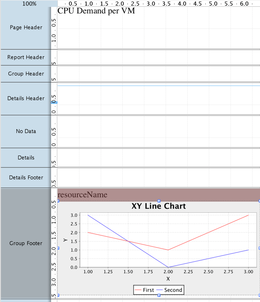
At this point, we have a nice data stream with one entry per sample, along with a resource name and a timestamp. Time to build a report! To do that, we use the graphical Pentaho Report Designer tool. Our report will look something like this in the designer:
Grouping the data
We could, of course, just put the data stream in the details section of a report and be done with it, but it wouldn’t make a very interesting report. All it would do is to list a long litany of samples for all the resources we’ve selected. So obviously, some kind of grouping is needed.
We solve this by inserting a, you guessed it, Group object into the report. A group object allows us to group the data based on some field or condition. In our case, we’ll group it by the “resourceName” (the name of the VM). Thus, we’ll have one group per VM.
Adding the graph
Now we can add the graph. But where do we add it? Let’s examine the sections in the screen shot above. There are couple of things to take notice of. First, anything we put in the Details section gets repeated for every row in the dataset. So if we put the graph there, we’d get thousands of graphs each showing a single datapoint. Clearly not what we want.
So what about the group? How can we put our graph at a group level? That’s where the group header and footer come into play. These are intended for summaries of a group. And since we want to summarize all the samples for a VM (which is the grouping object), that seems like a good place. Most tutorials seem to recommend using the group footer.
Configuring the graph
Once we’ve added the graph, we need to configure it. This is done simply by double clicking on it. First we select the graph type. For a time series this has to be set to “XY line graph”.
Once we’ve done that, we can start configuring the details. Here’s what it looks like:
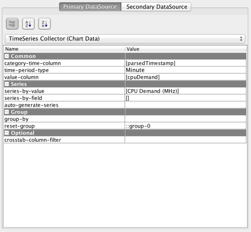
First, we need to select the TimeSeries Collector. This causes the data to be handled as a time series, rather than generic X/Y coordinates. Then we pick the “category-time-column” and set it to our timestamp field and set the “value-column” to “cpuDemand”.
Next, we edit the “series-by-value” to provide a graph legend.
Finally, we set the “reset-group” field to “::group-0”. This resets the data collection after every group, preventing data from being accumulated.
Parameters
Finally, we need some way of keeping track of variables like the hostname, username and password for the vRealize Operations instance we’re working with. This is done through parameters of the transformation that are exposed as report parameters. We can provide defaults values and even hide them from the user if we are always using the same instance and user. See below for a discussion on the parameters!
Installing and running
So far, it’s been a lot of talk about the theory of operation and the design. Let’s discuss how to install and run the report!
Installing Pentaho Reporting
- Download the Pentaho Reporting Designer from here.
- Unzip the file and go to the directory where you installed the software.
- Run it with report-designer.sh on Linux/OSX or report-designer.bat on Windows.
Allowing use of self-signed certs
If your certificate for vRealize Operations is signed by a well-known authority, you should be good to go. If not, you need to perform these two steps.
On windows
Edit the file report-designer.bat. Insert the java parameter “-Djsse.enableSNIExtension=false” on the last line. The line should look like this:
start “Pentaho Report Designer” “%_PENTAHO_JAVA%” -Djsse.enableSNIExtension=false -XX:MaxPermSize=256m -Xmx512M -jar “%~dp0launcher.jar” %*
On Linux/OSX
Edit the file report-designer.bat. Insert the java parameter “-Djsse.enableSNIExtension=false” on the last line. The line should look like this:
“$_PENTAHO_JAVA”-Djsse.enableSNIExtension=false -XX:MaxPermSize=512m -jar “$DIR/launcher.jar” $@
Finally, you will have to add the certificate from vRealize Operations to your java certificate store. This can be done by downloading your cert from your browser (typically by clicking the lock symbol next to the URL field) and following these instructions.
Installing Pentaho Data Integration (Kettle)
This step is optional and needed only if you want to view/modify the data transformation pipeline.
- Download Pentaho Data Integration from here.
- Unzip the file and go to the directory where you installed the software.
- Run it with spoon.sh on Linux/OSX or spoon.bat on Windows.
Allowing use of self-signed certs
If your certificate for vRealize Operations is signed by a well-known authority, you should be good to go. If not, you need to perform these two steps.
On Windows
Edit the file spoon.bat and insert the following line right before the section that says “Run” inside a box of stars:
On Linux/OSX
Edit the file spoon.sh and insert the following line right before the section that says “Run” inside a box of stars:
OPT=”%OPT% -Djsse.enableSNIExtension=false”
REM ***************
REM ** Run… **
REM ***************
Finally, you will have to add the certificate from vRealize Operations to your java certificate store. This can be done by downloading your cert from your browser (typically by clicking the lock symbol next to the URL field) and following these instructions.
Running the report
- Start the report designer.
- Select File->Open and load the CPUDemand.prpt file.
- Click the “Run” icon.
- Select PDF.
- Fill in the host, username and password for vR Ops.
- Click OK.
Next steps
The purpose of this project was to show the some of the techniques used for running a report generating tool against vRealize Operations. Arguably, the report we created isn’t of much value. For example, it will only pick the 100 first VMs in alphabetical order and it’s rather slow. For this to be useful, you would want to pick VMs based 0n some better criteria, such as group membership or VMs belonging to a host or cluster.
We will explore this and other techniques in an upcoming installment of this series when we are building a more useful “VM dashboard” report. Stay tuned!
Downloadable content
The data transformations and report definitions for this project can be downloaded here.
